ANLY 503 HW2 Plots
About the Plots Above
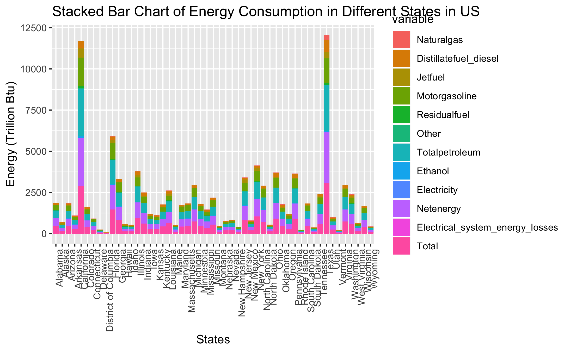
Stacked Bar Plots - R
The stacked bar plots reveals the energy consumption of different energy categories in different states. By coloring different energy categories, we can tell the main energy category in each state along with their total expense. We can tell that the energy consumption is related to the size of the states, the economic growth of the states, and potentially the population of the states.
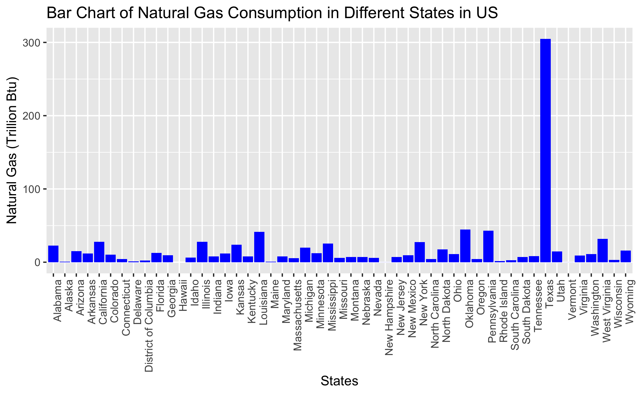
Bar Plot of Natural Gas Consumption - R
This plot shows the consumption of natural gas in different states in US. It is very interesting that Texas is very outstanding among all other states. This maybe because Texas is one of the main natural gas producing states in US, therefore it is convinient for Texas industries and public to use natural gas.
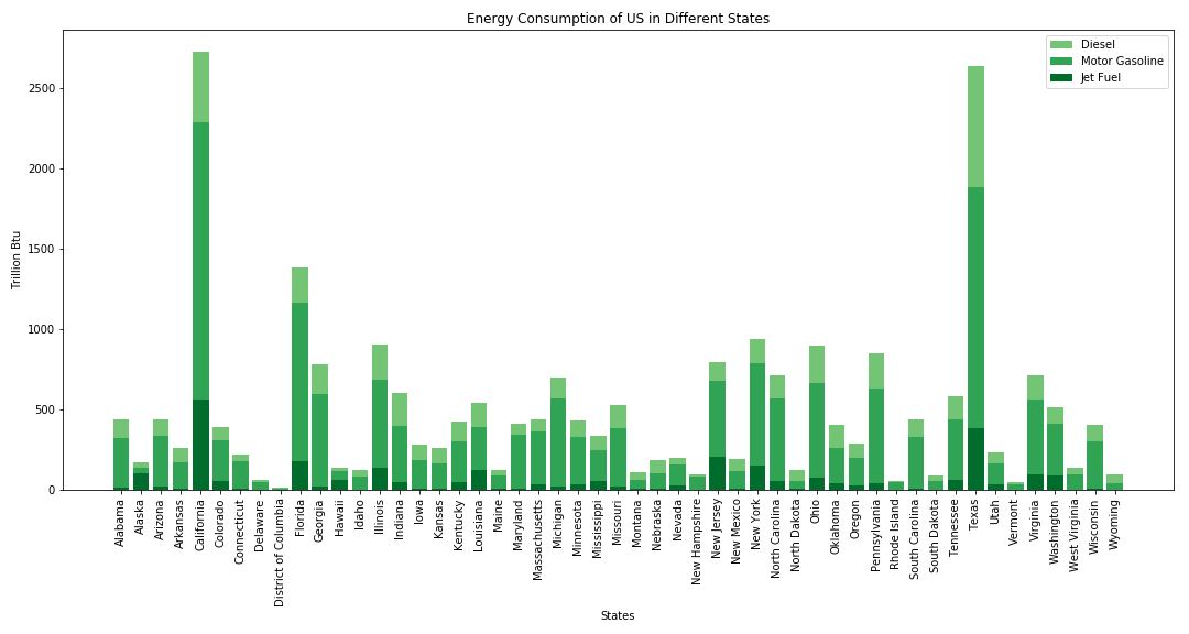
Stacked Bar Plot of Diesel, Jet Fuel, and Motor Gasoline - Python
This stacked bar plot focused on the three main energy consumption of small and large motor vehicles. From the plot we can obviously tell that California and Texas are the two states with highest motor vehicles energy consumption. The result is very reasonable considering the population and number of motor vehicles in those two states. Generally, from the plot, the higher the economic growth of the states, the higher the consumption.
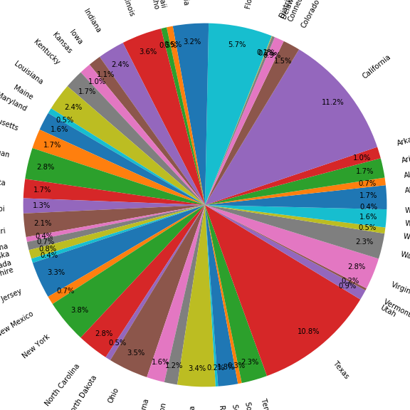
Pie Chart - Python
The pie chart shows the portion of the net total energy consumption in each states, considering US as a whole. From Pie chart we still see Texas and California as the main states of energy consumption. New York and Florida are following after the two states just mentioned. The results are obvious based on our previous observation.
Plotly Plot in R - Pie Chart
The pie chart of the total energy consumption of US in different states created by Plotly gives interactive data visualization. Similar to the pie chart plot by matplotlib, it shows the proportion of total energy consumption by states in US. Ploty automatically sort the states by the amount of their consumption to the whole country, from high to low. Therefore we can easily tell the top 5 states with high energy consumption: Texas, California, Florida, New York, and Illinois.
Plotly Plot in Python - Pie Chart
The pie chart of the net energy consumption of US in different states created by Plotly gives interactive data visualization. Similar to the pie chart above, it shows the proportion of net energy consumption by states in US. Ploty automatically sort the states by the amount of their consumption to the whole country, from high to low. Therefore we can easily tell the top 5 states with high energy consumption: Texas, California, Florida, New York, and Illinois.
Plotly Plot in Python - Stacked Bar Chart
The stacked bar plot of all categories of energy consumption in different states in US created by Plotly reveals the same information as the first plot that we introduced, but in an interactive way. Now by hovering cursor over bars, we have the relative information of the energy consumption showing up.


